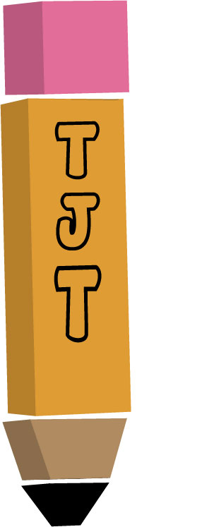
I created a 3d pencil with my business’ name going down the pencil. I created this because my topic is being an entertainment publicist which they make statements etc. for athletes, singers, big events and to make sure that they look good in the public eye. I didn’t really look at any logos, so I didn’t really have any ideas of what a logo should look like and I also didn’t want to accidentally make a logo that looked like one that was created. My logo doesn’t have much complexity to it or a lot meaning behind so ideas would be greatly appreciated because I feel like my logo needs some spice to it or just a totally new logo so ideas would greatly be appreciated but overall I think my logo represents my topic because of publicist do a lot of writing but it could use something to make it stand out more. I use the redesign process because at first I was going to make the pencil a pen but then I had a hard time trying to incorporate my business name which I felt is an important part to my logo because if I was to put this logo on my business cards the first thing someone would want to see is what’s my business name and second of all what my business does. I created all of the elements of my logo in illustrator it was difficult for me because none of the illustrator tutorials that we had to do for our assignment showed us how to make the shapes 3d so I had to explore illustrator and figure it out once I figure out to make them 3d it was hard for me to get the shapes all aligned (which they are still kind of off) but I underestimated my logo because I didn’t think it was going to be that difficult to make the shape since we did something similar in tutorials but it made it harder because I turned the shapes into 3d shapes.

Hi Tierra!
First of all I do love the pencil idea, and see what you’re trying to get at when thinking of ideas for a logo! If you wanted to spice up the pencil, you could Ombre it a little to make it more fun, and you could add a phrase or a saying about your company you want to create! I think that would make your logo more original! I do love how you made it 3D though because that is super cool looking I think. Another comment I had was to make sure to read over your paragraph because I see some sentence grammar errors, and little punctuation errors, but overall I like the overall design of your logo! I hope you can manage finding the perfect logo to turn in this week!
Elyssa Robinson
LikeLike
As I look at my logo I still feel as though my logo is simple and is kind of bad but after looking at the comments from my peers I will try to contribute another factor into the logo like a pen and add some gradient to make it less bland. I will go back and brainstorm to try to figure out how to contribute the pen into my logo, so it still looks good and looks like it flows. I felt before as though my logo wasn’t good at all and that I was just going to make a different one but as I look at it and take in the comments from my peers I will add a pen to the logo to make the logo look better and when I add the pen to make sure I add gradient and even some cool text ideas so my logo can catch the eye of people if it was to be on a card, shirt, jacket, etc. I want it to catch people’s eye no matter what it is on.
LikeLike