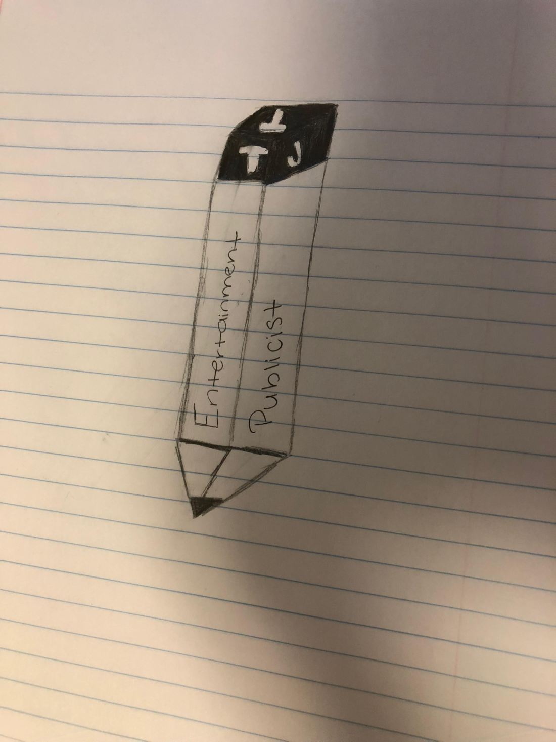
 With my sketch I am going to try to accomplish a 3-D effect. my logo is a pencil but except instead of having an eraser as the top I want to be a cube and have my business name on it the reason why it’s shaded because I want the cube to be pink like an eraser and the letters as a cut out and then on the side of the pencil it says entertainment publicist because that’s what my topic is about.

Hi Tierra,
Great job on your logo! After reading your description I couldn’t agree with you more when you stated you did not want to look at other company’s logos because you were afraid you would copy it. I was afraid of the same thing so I tried not to look at other logos either. Two suggestions I would give you is to add more to the logo, and bold your letters more. The reason why I say add more is because the pencil looks very similar to the ones we did during the tutorials, perhaps you could add a paper or a pen next to it? Or maybe add another symbol around it. To go off my second suggestion I would say bold the letters so people really understand what your topic is, as opposed to solely being focused on the pencil. One area where you excelled was the pencil itself, I love how you made it 3D and it looks like you spent a long time working on it. Fantastic work!
LikeLike