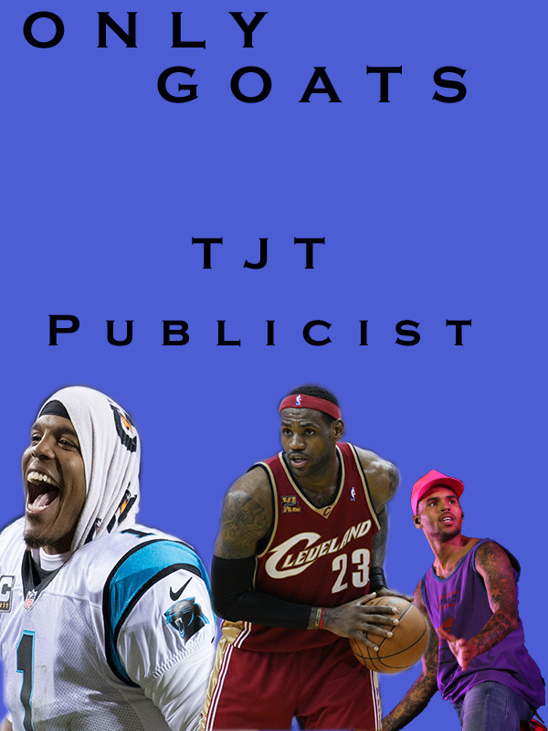
My topic is becoming an entertainment publicist. For this project I decided to make a promotional poster to try to promote the business I wish to create one day. I wasn’t sure at first how to create a promotional poster so I decided to look online for some ideas to help me get a start on mine that’s when I got the idea to get a picture of Chris Brown that I could use and get some pictures of myself it was a little hard because I wasn’t sure at first what I wanted my business to be called then I just thought of keeping it simple with T J T publicist company the first T stands for Tierra, the J stands for Janae my middle name, and the last T stands for Trail. I noticed when looking at other promotional posters they always say we they are about at the time and in attention grabbing language so that helped me to know that my poster need to have color in it and be vibrant because if it was boring looking no one would pay attention to it. When I was creating this I was trying to think about unity because I felt if it didn’t have unity then it wouldn’t attract people’s attention and that’s the whole point of a promotional poster. I collected the pictures from google by typing the names of the celebrities and making sure it was under labeled for reuse deciding who I was going to use wasn’t hard because I think Cam Newton and Lebron James are amazing athletes and I think Chris Brown is an amazing artist. I use the pen tool to cut out the celebrities I used I had a hard time at first because I forgot how to actually make it cut and copy so I went back to the photoshop videos and remember how to use it.
Rinaldi, Eva. “ Chris Brown Performs at Supafest 3 Sydney, Australia 2012.”, WiKimedia Commons, 15 April. 2012,

some rights reserved
Allison, Keith. “Lebron James. Washington Wizards v/s Cleveland Cavaliers.”, Wikipediya, 18 November. 2009,
https://tk.wikipedia.org/wiki/Fa%C3%BDl:Lebron_James_18112009_1.jpg
some rights reserved
Allison, Keith. “Carolina Panther quarterback, Cam Newton, during a game against the Washington Redskins.”, Wikimedia Commons, 20 December. 2016,

some rights reserved

Overall it is a solid start! I really like the title of your company, it is simple and strong. As for the picture I really like the idea your going for of the poster. I also like the celebrities you decided to use on the poster. Improvements I would suggest is spicing up the text and editing the cutouts. For the text, I think it would be better if you added an effect to the text. Right now the text is a basic font and doesn’t pop much. If you warped the text or used some kind of word art I think it would grab the attention of the viewers more. The second improvement I would consider making is editing the cutouts of the celebrities more. I think if you added some drop shadows to the cutouts it would add more depth to the poster rather than being flat. Overall I really like your poster and I think it will come out really good.
LikeLike
Thank you for your feedback I really appreciate it and I am going to use your recommendations
LikeLike
I am really passionate about this topic because this was the main reason I decided to major in communications, so I was really excited to express that with other people. I think the celebrities I use are really good and I think the name I came up with is strong because it relates to me but not to the point where it is super obvious because not everyone knows my initials right away. I feel as though I rushed the draft because it was a draft, so I could edit the images a little bit and put some effect on it like it was recommended and fix up the edges on my Chris Brown image because it’s sharper then my other two images. Another improvement I can do is make the text to the point where it’s really attention grabbing because that’s what’s necessary for promotional posters so I could kind of mess around with the text for a little bit to see which one fits the poster best and really in a sense comes over the poster so that you pay attention to it.
LikeLike
I also think this is a great start! I think it was smart of you to put the celebrities or athletes that you are aiming to work around or with. That helps us know what your main direction of being a publicist will be. A few changes i would suggest is to maybe type of what the “TJT” acronym since this is your first time introducing yourself. Like is it your name or does it stand for something else? Also I noticed that there is a party at the bottom of your image and just words at the top of your image so i would suggest to evenly spread out the excitement throughout the entire flyer. I like the blue in the background because it makes everything pop and helps grab the attention of your viewers. Keep up the good work and your flyer will look great!
LikeLike
I think this is a good poster so far because you did such a good job cutting the people, Cam, Lebron, and Chris Brown, out of their previous backgrounds. They aren’t distorted in any way and they look quite clean. However, I think they would look better if you could blend them in a little bit. I would suggest a drop shadow on each one of the people to help them look more natural. I also think that the one color of the poster just looks a bit bland. I would suggest adding partial shadow or even color fading in from a corner of the background by using the gradient tool on your background layer. I really think doing those two thinks will make your poster look a lot more professional. Good work on the poster, I look forward to seeing the final draft.
LikeLike
When reviewing your project post, I really like the title. I think it stands out and makes me interested to look into what you are talking about, it’s clever. Another thing that I have noticed is that you have 3 photos, 2 of athletes and another of Chris Brown the singer. I don’t know a lot about ‘Goats’ but I am a tad confused on how each are related. Another suggestion I would like to make would be to have a better background, something more than a solid color. Use something that ties into what your project is about so it is more than 3 people outlined. I enjoy the heading and fonts but maybe have the title bigger than the TJT Productions label, which is more important?
LikeLike